





The brochure was given to KCG employees to announce the new company’s brand values. The visual techniques developed for this brochure became the basis of the company’s visual vocabulary.
Agency: Thinkso Creative

With each spread a different graphic technique was developed using dots as a pattern, halftone, or pixel.

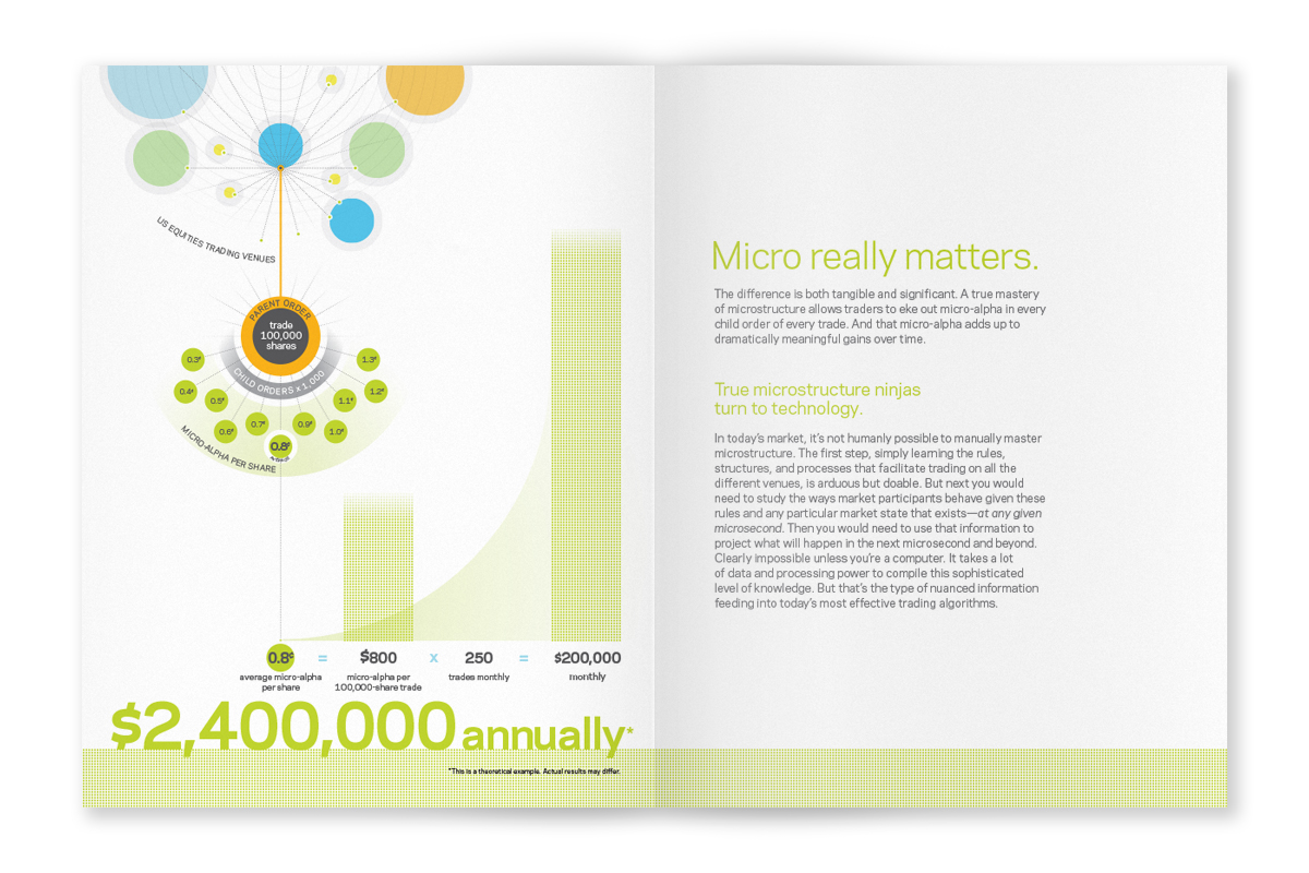
This brochure was produced to help the trading services division of KCG help explain the principles of microstructure and how micro-alpha can lead to millions of dollars in revenue.

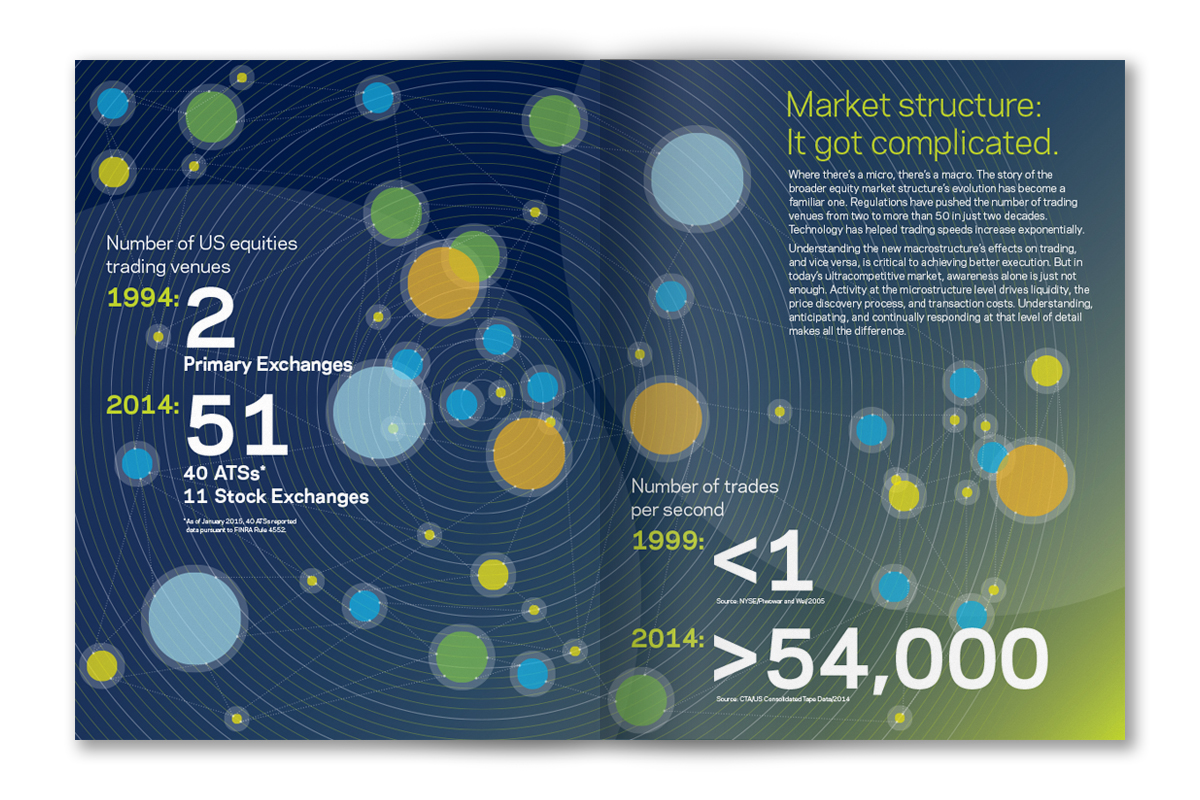
The opening spread explains the complexity of trading in today’s marketplace as compared to the marketplace 20 years ago. The amount of trading venues have increased and well as the amount of trades.

The fractional differences in trades can be gathered and accumulate to millions of dollars annually.

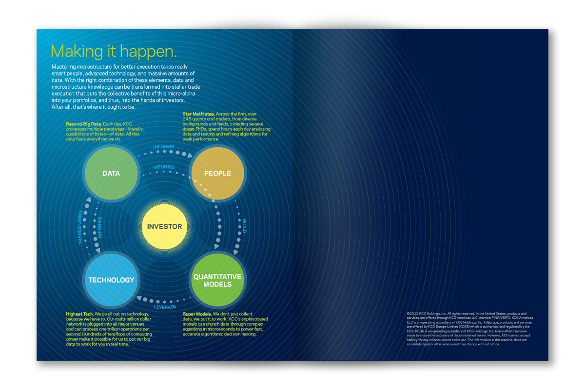
The resources of KCG work together to help the client with any type of information they need at any time.

Using the illustration and typographic styles developed for their identity, these large wall graphics were created to make the employee lounge, game room, and pantry more inviting.

The lounge was located in a area with no windows and no real view. This graphic was to give the employees a view that they wouldn’t normally have.

The tournament wall was laminated with a dry erase surface so employees can set up divisions and have ongoing tournaments.

The typographic messaging always had a sense of humor and always talked in the vernacular of the audience.

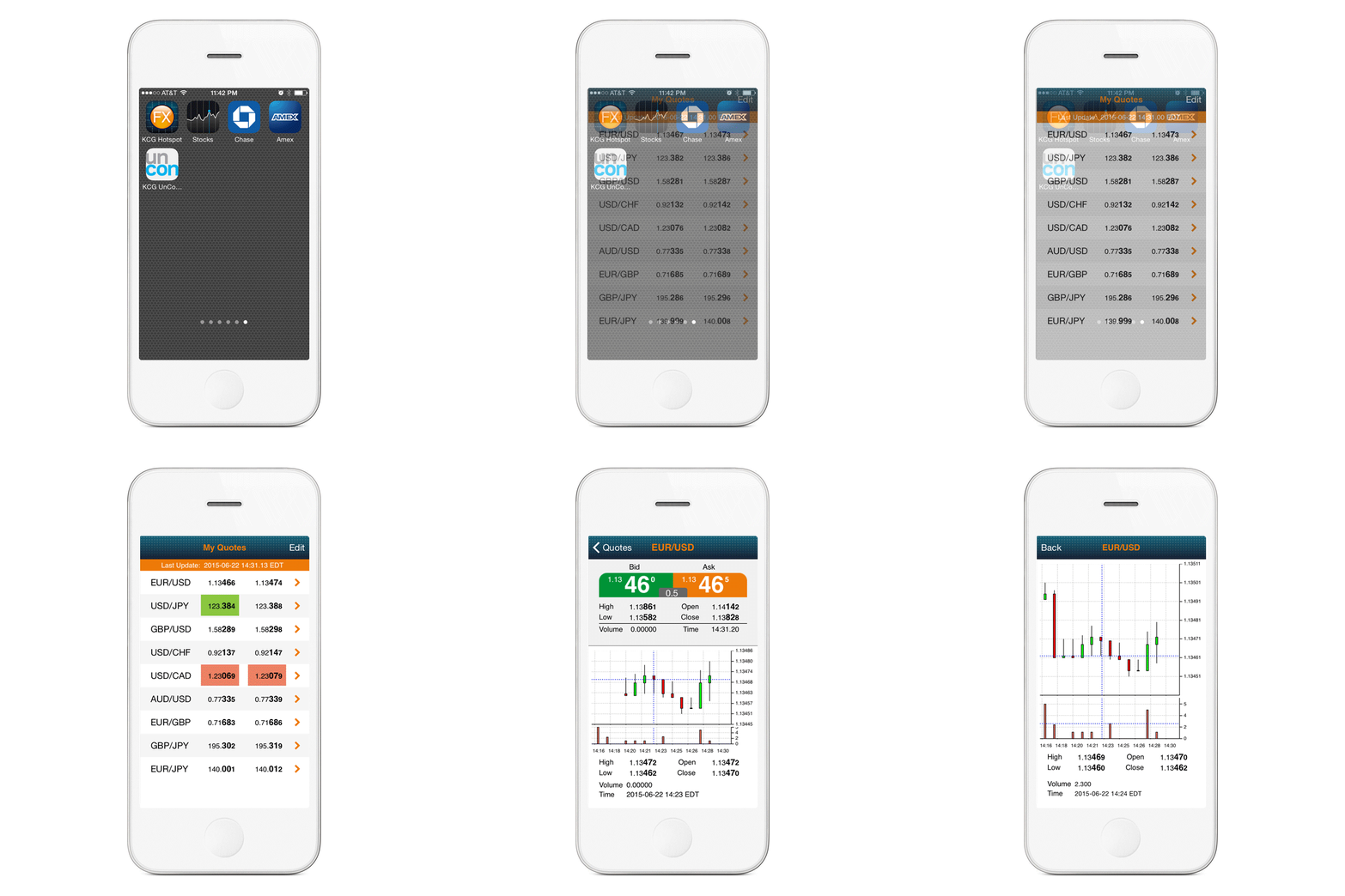
This custom app that views different pairs of currency exchanges along with their candlestick charts needed to be branded with KCG elements but still remain simple.
app icon by Lauren Fagan