
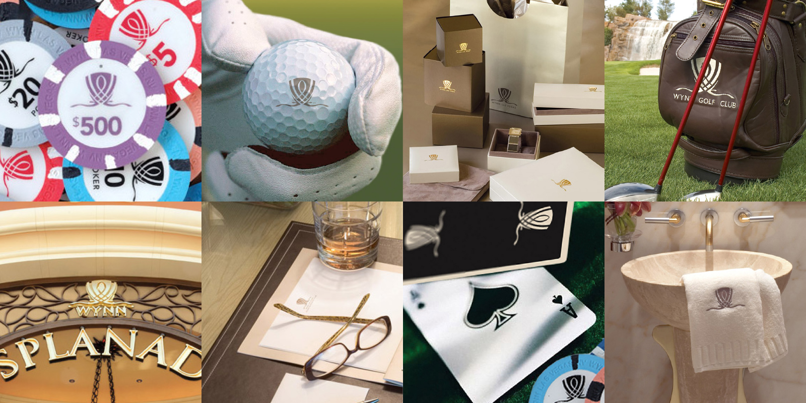





The Wynn Crest is the most beautiful and meaningful icon I have designed. It is a modern symbol of old world luxury representing Steve Wynn himself; moreover, its Arabesque curves connote the buildings panoramic structure and the graceful cambers found in the architecture of the property.
Agency: slover [AND] company

The crest was used throughout the property on items such as the casino chips and playing cards. It was also used to identify the country club, golf course, and parts of the retail esplanade.
Wynn shopping bag and box packaging by David Allegra

The simple paper menu system was perfect for Daniel Boulud’s relaxed brasserie atmosphere.

Along with many logos developed for this project, signage also had to be designed and specified. The logotype for the poolside bar and casino reflected the playful nature of gambling, drinking, tanning, and swimming at the same time.

The “8” of the Red8 logo was inspired by symbols from mahjong tiles and gave a unique look to Wynn Las Vegas’ Chinese bistro.

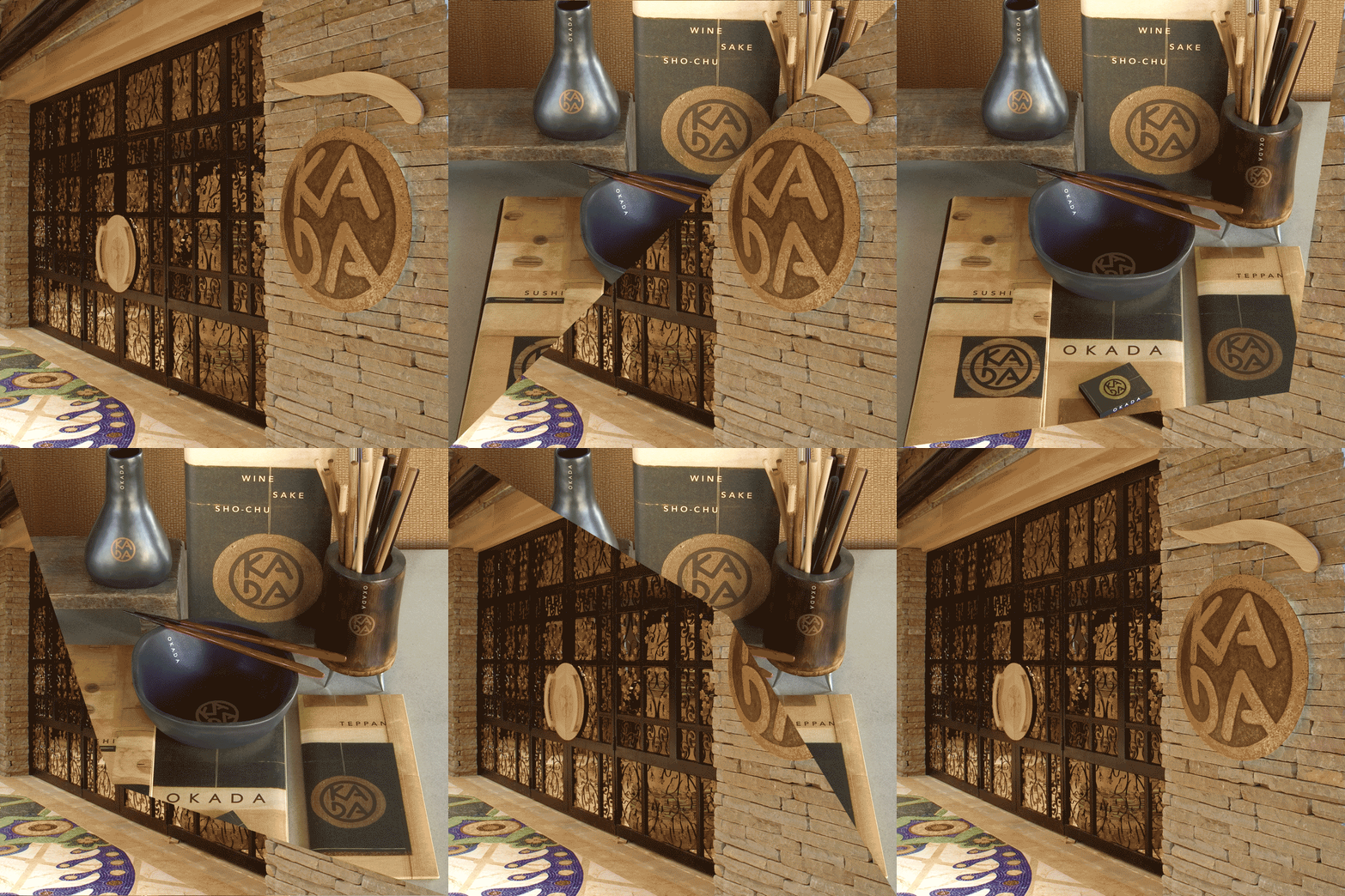
Designed to resemble a Japanese pottery mark, the Okada logo lent itself to very interesting interpretations for signage and restaurant collateral.

The Steakhouse at Wynn Las Vegas was named after Steve Wynn himself. The logo was blind de-bossed on the post and screw bound leather menus which gave the illusion that it was branded.
Menu design by Amy Gorrek

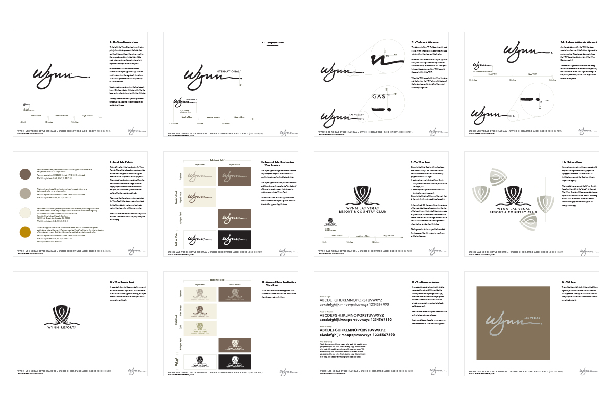
Each individual restaurant and shop on the hotel property had an simplified identity manual developed to help the managers create any new graphics.

The Wynn Hotel had its own custom bath amenities developed for the room and for sale at the Wynn store in the shopping esplanade.
Packaging developed by Saskia Mehl

Steve Wynn used the crest on many of his personal items. One of which was his personal Gulfstream G5 jet. Custom paint colors were developed to match the colors of the hotel. The cheat lines also mimicked the lines of the crest and the hotel.

The logo design was carefully crafted to match the original Wynn Signature logo.
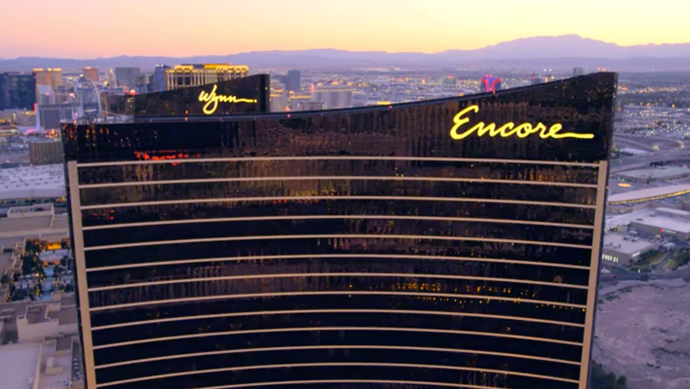
Video: Rick Ray / Shutterstock

As the first of many international properties to be developed, the graphics of the Wynn Hotel & Casino in Las Vegas set the precedent. The identity manual was the resource to design new graphics for the Monaco and Macau properties.

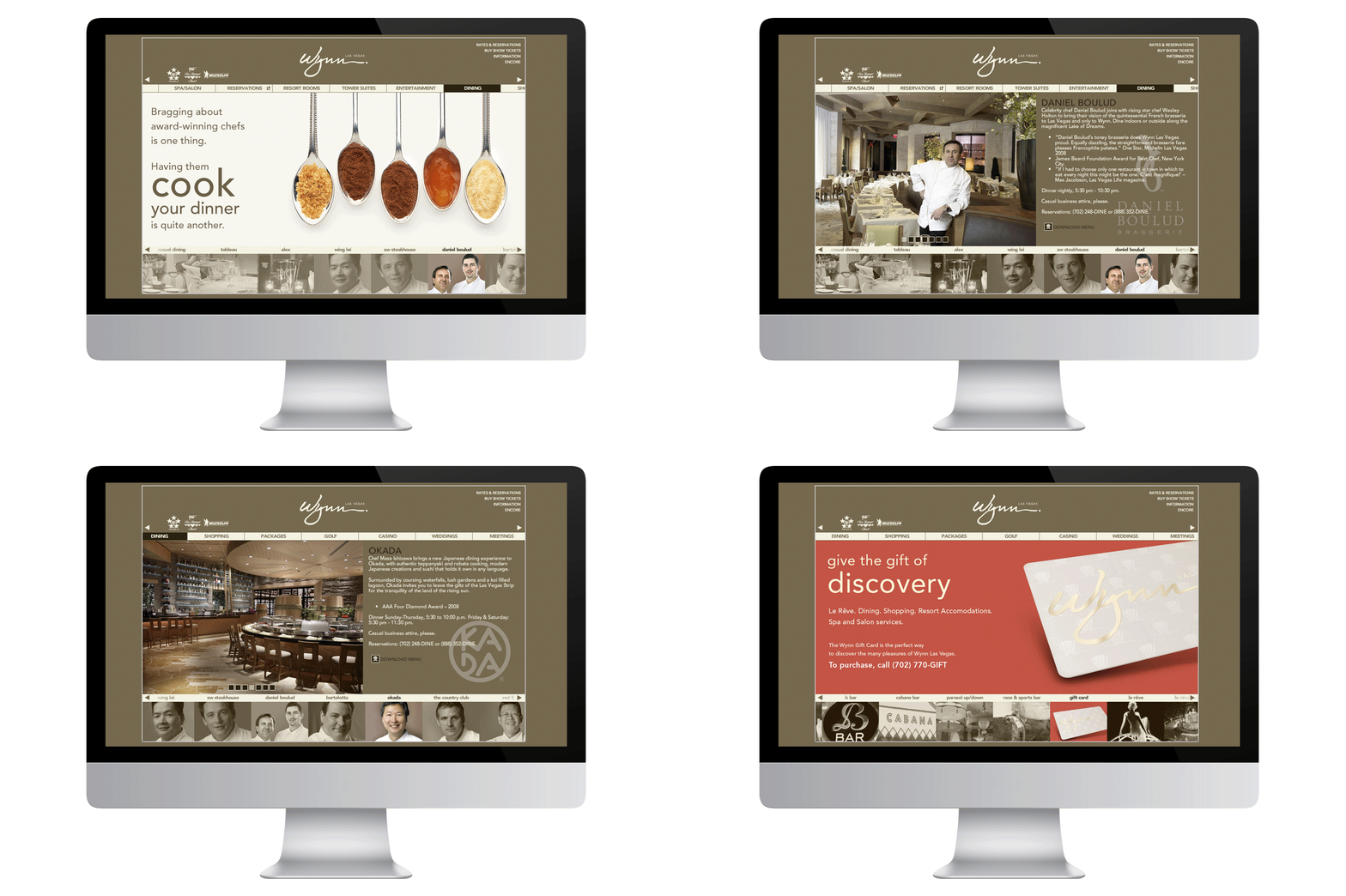
The original website was quite developed for its time. The Flash based website was panoramic like the hotel, featured a scrolling navigation, and featured video interviews with Manolo Blahnik, Daniel Boulud, Alex Stratta, and many others that help created the spirit of the hotel.
Co-designer: Karin Folmin