






Zen Palate sought to spread their franchise nationwide. The marketing team had to update the brand with new ideas, new recipes, and new design. The challenge of this project was to build on an already proven idea and still keep the integrity of the restaurant’s purpose and spirit.
Agency: Mr. Grey

A fresher, more vibrant color palate was one of the updated to Zen Palate’s identity. This was used extensively on the signage and cafe barricades.

During the renovation, parts of the restaurant was closed for guests. As a consolation, free drink tickets were given to any customer who could not be seated. The simple trick of adding a tassel, gave the simple card a more memorable look.

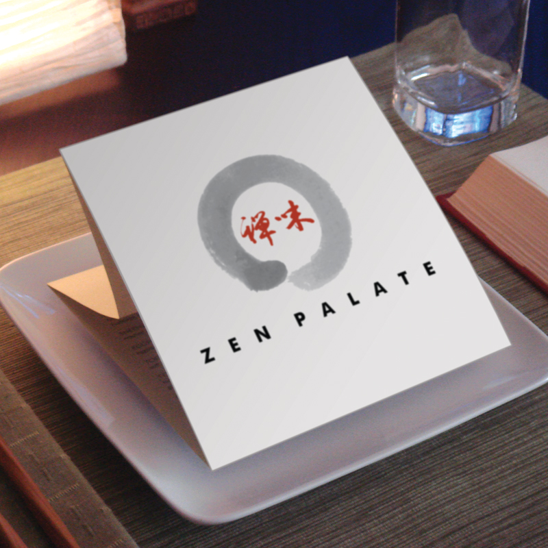
Even the small restaurant collateral like the cafe/takeout menu were re-designed for a fresh look. The simple trick of folding the center panel of this three panel menu allowed it to recline slightly at the cafe tables.

A custom set of illustrations helped the graphic vocabulary of the identity. They were used in banners and promotions as well as a background on the fine dining menu.

The illustrations and new color palate provided instant recognition for any change in the seasonal menu. There was a rotating set of illustrations and colors for this purpose.

The bi-level restaurant and lounge was named after the mother of Sigmund Freud. The decor was dubbed “Hyper-Baroque” a mixture of design elements taken from different parts of old Europe with a modern touch. It was ornate, lavish, whimsical, and over the top.
Agency: Daniel Scharfman Design

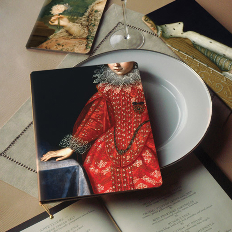
The menus were inspired by the reporductions of historic European portraits that were hung from the ceiling. They were cropped carefully to highlight the hand and mouth. The two parts of the body essential to dining and drinking.

The cropping of the portraits also extended to the rest of the restaurant collateral. There were several different coasters. Even the business cards would have a different portrait that identified the member of the staff.

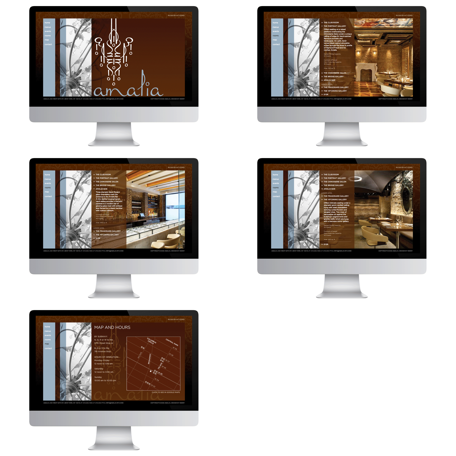
The simple to navigate website featured more than just the menus. It was targeted to be booked for large events and showcased the capacity of each event space and examples of how drinks, food, and hor d'oeuvres can be served.

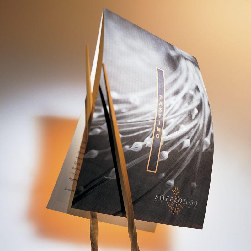
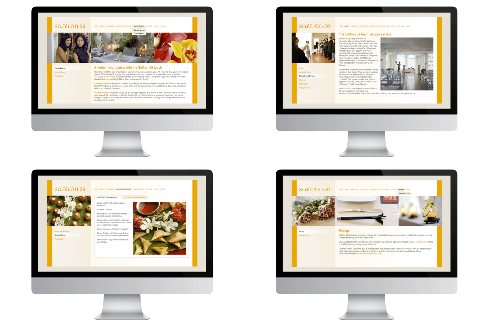
The menu showcased the offerings of the premier Asian caterer of New York City.
Agency: Daniel Scharfman Design

The website showcased their event planning as well as their catering expertise and lead to an increase in bookings thru their online questionnaire.