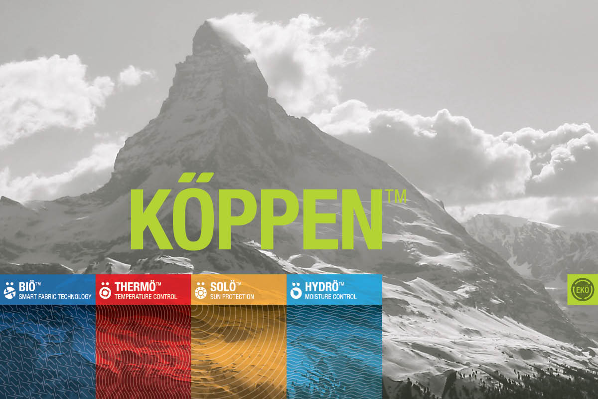







The Dick’s Sporting Goods outdoor gear and clothing system was named after German/Russian geographer, meteorologist, climatologist, and botanist, who created the colorful Köppen climate classification system.
Agency: Graj + Gustavsen

The on-clothing logos consisted of a mix of the full logo and the stylized umlaut. The umlaut was always used on the outside of the garment and became the clothing line’s icon.

Each clothing benefit was named with an “O” so that there could be an umlaut placed above it. With each clothing benefit, a custom wordmark, symbol, color gradient, and pattern was developed.

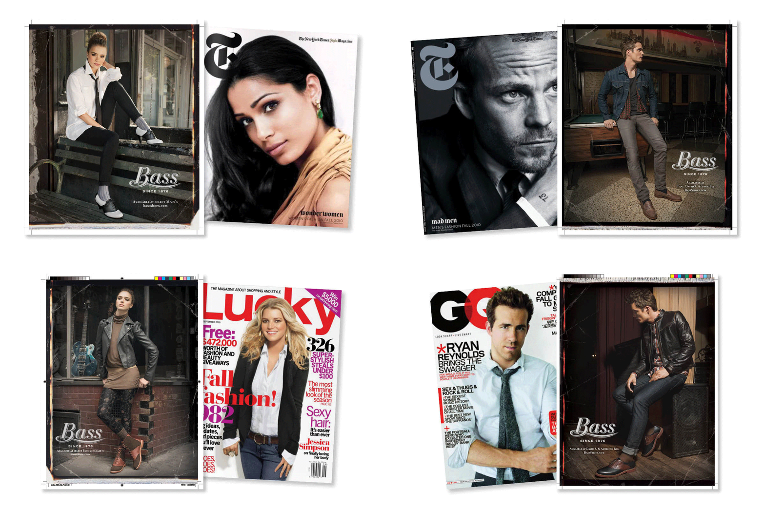
Having made its way out of the outlets and into retail stores like David Z and Urban Outfitters, Bass Shoes decided to launch its first advertising campaign in 10 years. The “flagship shoe” that launched this initiative was modern, high-heeled version of their iconic Enfield saddle shoe.
Agency: Gale Branding

The focus was on a younger, music oriented crowd with the photoshoot staged at The Warsaw, Ludlow guitars, and Freeman’s Alley.

The proposed “Halo” brand was the premium (and most expensive) line of the Harley-Davidson’s new fashion and apparel initiative. Meant for nightlife instead of life on the road. This line elevated the brand into a more affluent market.
Agency: Graj + Gustavsen

The retro-modern look of Modern Vintage, with a new winged shield and bar logo, reckons back to the days when motorcycles meant turtlenecks and tweed jackets accompanied Jodhpur pants and knee-high boots. This line was imagined as a Jack Spade brand for motorcycle clothing.

The very important denim line offered less distress in the clothing and more of the selvage denim and oil slick look of 1950’s bikers. It was rugged and worn, but a bit more refined.

Imagined as the original khakis G.I.s wore after wartime. This line paid homage to the original bikers born after the end of WW2. All sizes and clothing information was to be stenciled on like army surplus material.

Made for the rider that always works on his own bike, the H-D Workgear was less fashion and more utilitarian clothing boasting clothing benefits with the graphics resembling technical specs. It was Harley's version of Dickies.

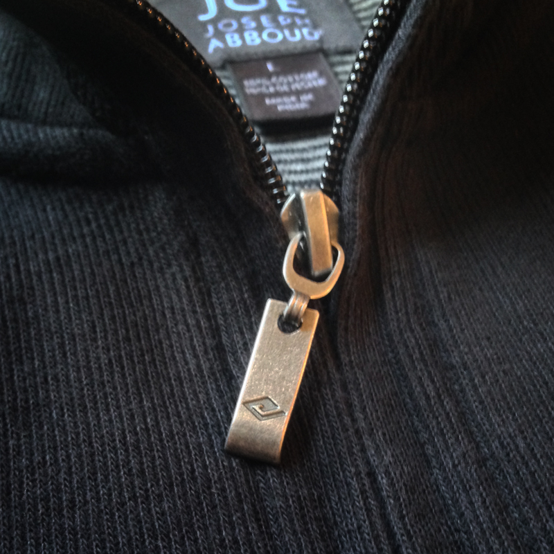
Initially created for a licensed clothing line for JCPenny, the JOE logo extended itself to brand its own licensed eyewear.
Agency: Yard | Photo by Nicholas Wray

The Italian hosiery’s outdoor campaign consisted of four 4 key shots which was retouched for 8 different size ratios, that was applied to 32 different mechanicals.
Agency: slover [AND] company

The fleur de lis, with its hidden “H”, represented New Orleans – the original location of the Haspel headquarters.
Agency: Graj + Gustavsen

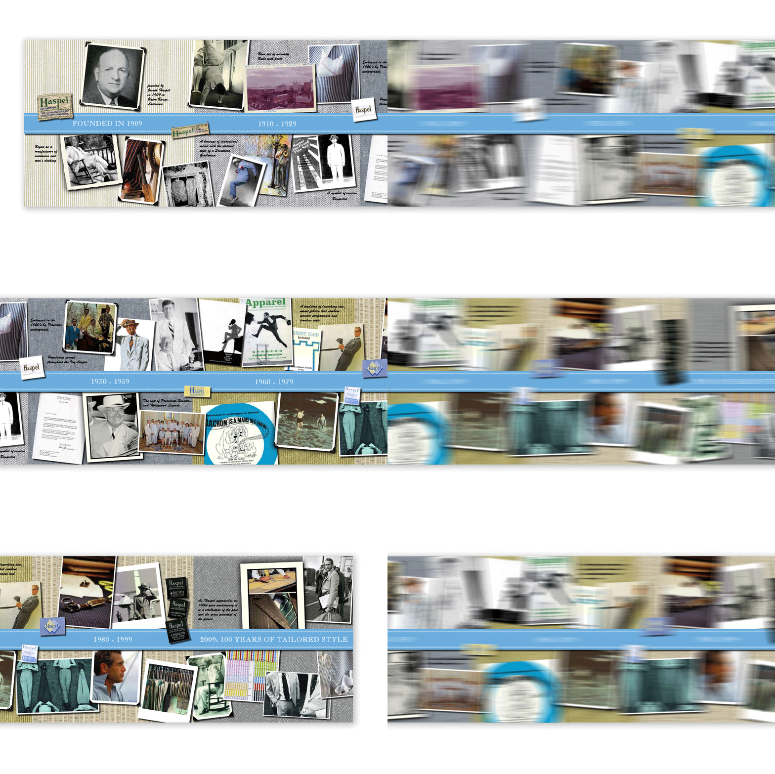
To help the marketing department explain the history of the Haspel brand to retailers, this timeline was created showcasing vintage photos, clothing labels, and advertising.