





The renovated luxury condominiums boasted a state-of-the-art gym, entertainment space, communal rooftop deck, and a private park.
Agency: AgencySacks

The developers of the new apartments wanted custom numbers designed for the logo. The number system was extended for the numbers of the apartment doors.
Agency: AgencySacks

The retail real estate company needed a new look for their marketing and promotional collateral. The result translated into a new, broader identity which included convention graphics and outdoor advertising.
Agency: Daniel Scharfman Design

The areas of expertise were differentiated by five different colors. The colors became the color palate for the new identity.

The austere white folder with the spot UV lettering was balanced with the much more colorful brochures placed inside.

The look of the new ad campaign had to be maintained by consistently choosing the right stock photography and maintaining the layout for each ad insert. Specifications were developed in the brand guidelines to keep the typography and layout consistent.
Agency: AgencySacks | Creative direction: Lynn Kokorsky

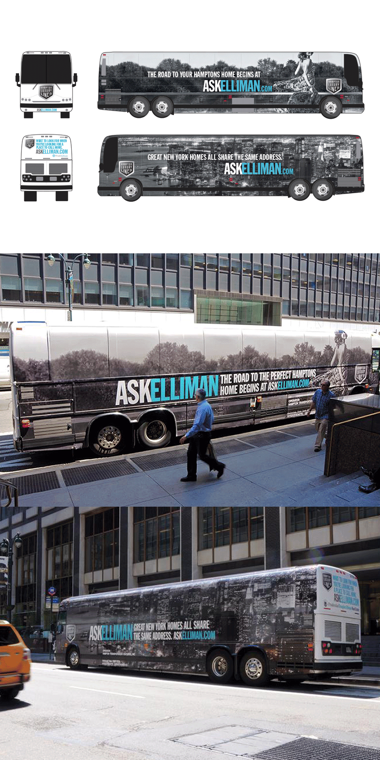
The bus wrap was great exposure to the Manhattan-to-Hamptons crowd Elliman was trying to target for the properties they represented in both areas.

The shopping bag acted as another vehicle of advertising as potential buyers would walk away from open houses with the bags containing copies of Elliman magazine, property sheets, and other collateral.

The previous website had to be updated to reflect the new aesthetic of the revised branding. The new design and improved interface was recognized by the International Property Awards. www.elliman.com

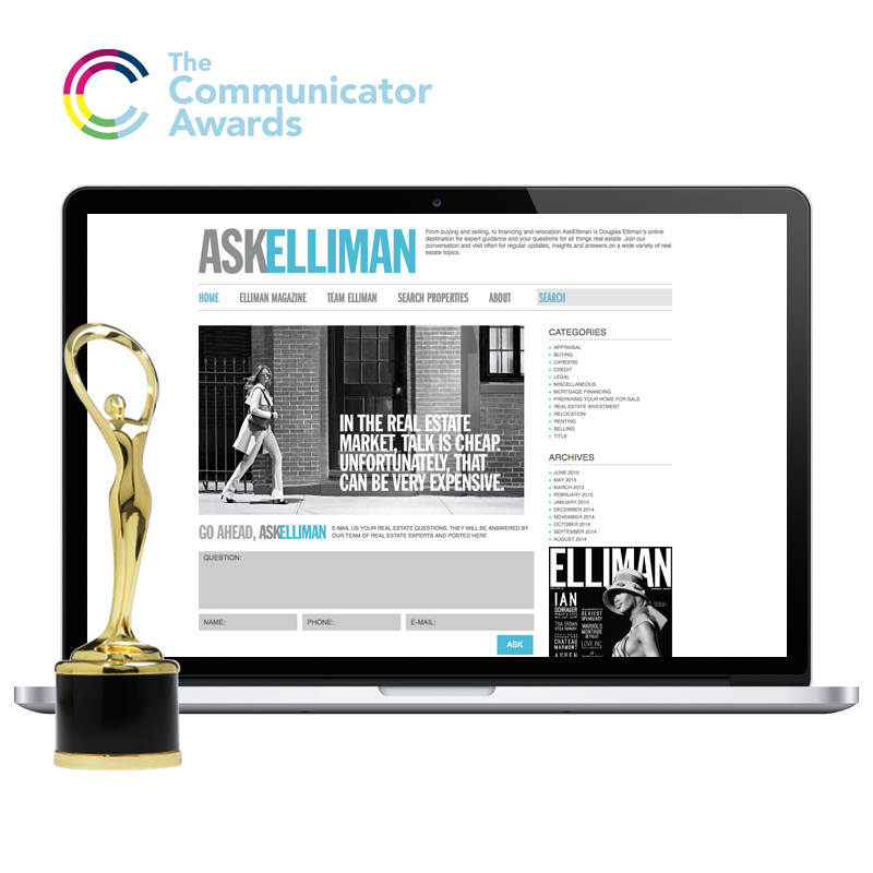
The new companion blog of the Douglas Elliman website was recognized with the Award of Excellence by the 20th Annual Communicator Awards. www.ask.elliman.com

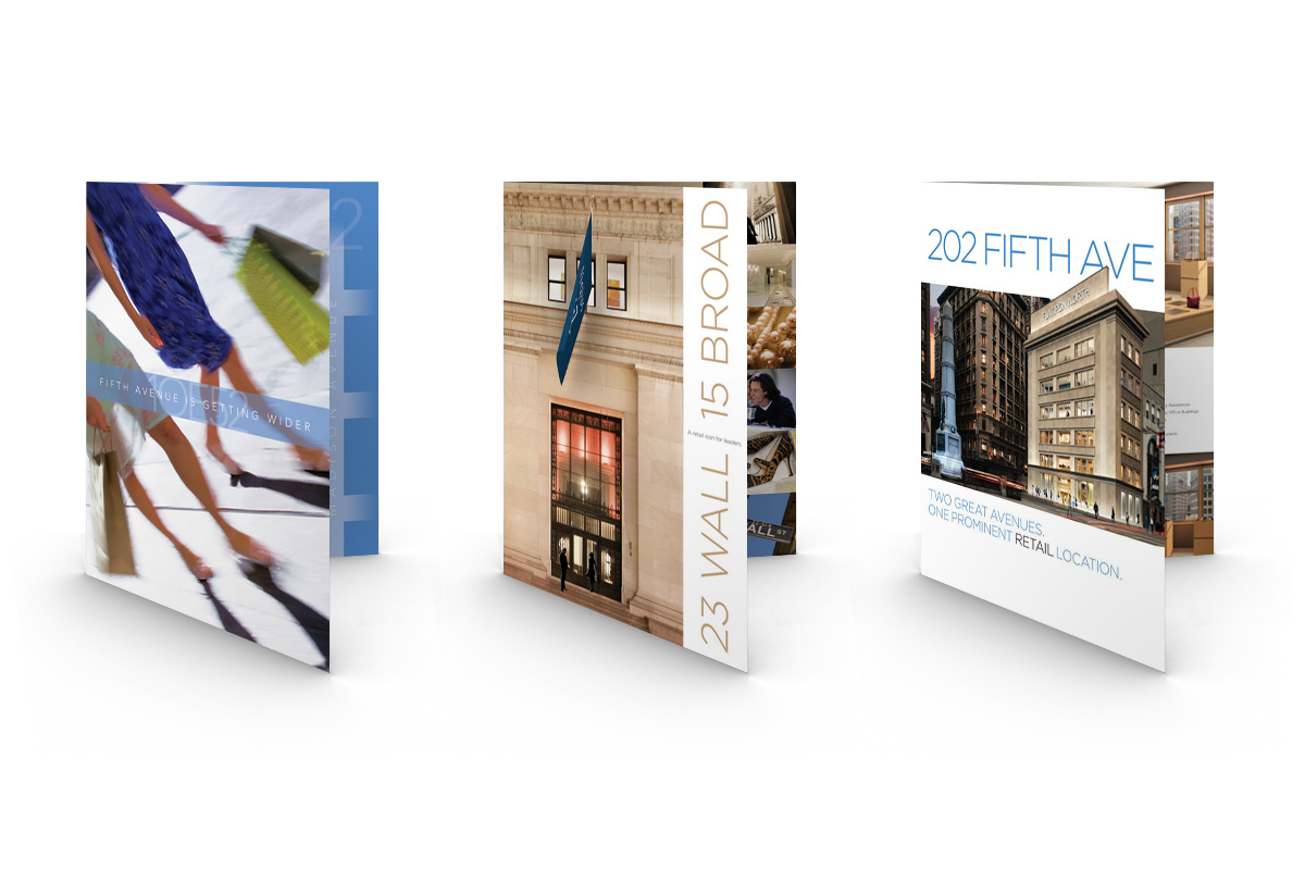
The full service real estate firm’s brochures developed into a series of retail properties they represented.
Agency: Daniel Scharfman Design